Less, but Better
People's preferences are changing so you should also go with the flow. The latest technologies keep people craving for something new. But it doesn't mean that you have to create new designs or graphics to sell. You can reuse your old designs and add some elements that your viewers want to see. Innovate your designs but keep in mind that user experience should be your top priority when designing, be it a graphic or a web design. You only need to pinpoint and understand what your viewers or customers wants.Be Neutral
Your designs should not only be pleasing to the eyes but it should also be functional and serve their purpose. For example, if you are designing an online e-commerce website, it should not only look pretty, it must be easy to navigate while your web visitors look for helpful information and they can checkout without much fuss. Another good example for this when you are designing a scrapbook. You can add interactive elements to make it more functional.Be Honest
Strive to make your design appear authentic and truthful. Do not add information that are deceptive and trick your viewers. They might get the wrong idea of what you trying to show them. For example, if you are designing a flyer or a brochure for a particular brand, just add information and elements that convey the actual product. Nothing more, nothing less.Go For Timelessness
Every designer knows that timelessness is one of the qualities of a good design. But if it you are still wondering how to achieve timelessness, then I will explain it in the simplest way I can. To make your design timeless, you should consider symmetry, create a focal point, use classic patterns, and stay away from trends as you hide the technology.Less “Design”
We often hear or read the expression "Less is more." It was first appeared in Robert Browning's poem Andrea del Sarto in 1855.Make your design simple because, sometimes, simple designs are better than complicated ones. Just elevate what is essential and that would be great. You should bear in mind that the content is always your priority. Just learn how to arrange them.Be Thorough
Some designers tend to rush through things, especially when they have a deadline to meet. Remember that competition is part of our daily lives. One small flaw and it will crash your design. Look out for typography errors and bad composition. Be thorough down to the smallest details. Your design should be competitive enough so it will attract viewers. Take your time and use appropriate tools to achieve optimal results.Be Conservative
Your main goal is to create a simple an clean design so you should conserve your resources as you work on it. It is feels good when you finish your design without messing your work area and throwing away leftover materials.Take Your Time
Do not be so eager to see your results because you might end up rushing your your designs. Take your time. Do not rush to finish everything in one sitting. Set time to research and to outline your design so you don't miss the little details. Time management is very important in every aspects of our lives. And it does not exclude designing. Learn how to manage your time so you don't waste your efforts.Be Understood
Make your design understandable by your viewers easily. You should make it straightforward that when they see it, they know what it is for. For example, when you design a website, make it simple and self-explanatory that when someone visits it to look for answers to their questions, they can easily navigate through the menu and headers. Lay every important elements that they might use so they will not leave immediately. Think about designing a new phone. You ask yourself, is my design easy to interpret? Will my customers know how to use it the first time they see it?Make It Pretty
Accept it. People prefer pretty things. Aesthetics is a very important factor in achieving a good design. Designers use colour, balance, movement, pattern, and visual weight to enhance their designs. Although pretty things are attractive, do not set aside the functionality of your design because that is what will truly last. Try to balance the visual appeal and functionality of your design so your customers will trust your products.Conclusion
With aesthetics and functionality combined, you can create a simple but clean design. A good design should emphasize the products usefulness but at the same time it should be visually appealing to the customers. You can try these principles and find out what works best for you.
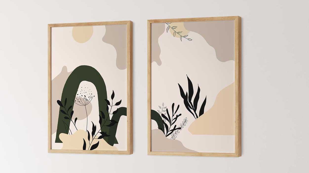
Have a look at these Wall Art I created as an example for clean design. It is a so called diptych where you put two images side by side and the one is a extension of the other.
In this case the two images can hang alone but also together while they just have a minimum amount of elements.
If you wanna learn how to create such minimal art and tell stories with it join me in my class
"Create Abstract Wall Art in Procreate and Photoshop"
Like all my classes you can find this one in the Safari Lounge Designer Classes:

Join the Library
It's FREE!
Inside the Library you can find lots of Printables, SVG files, Patterns, Templates and Material for my video tutorials! It's well worth to join. Try it, it's free.
