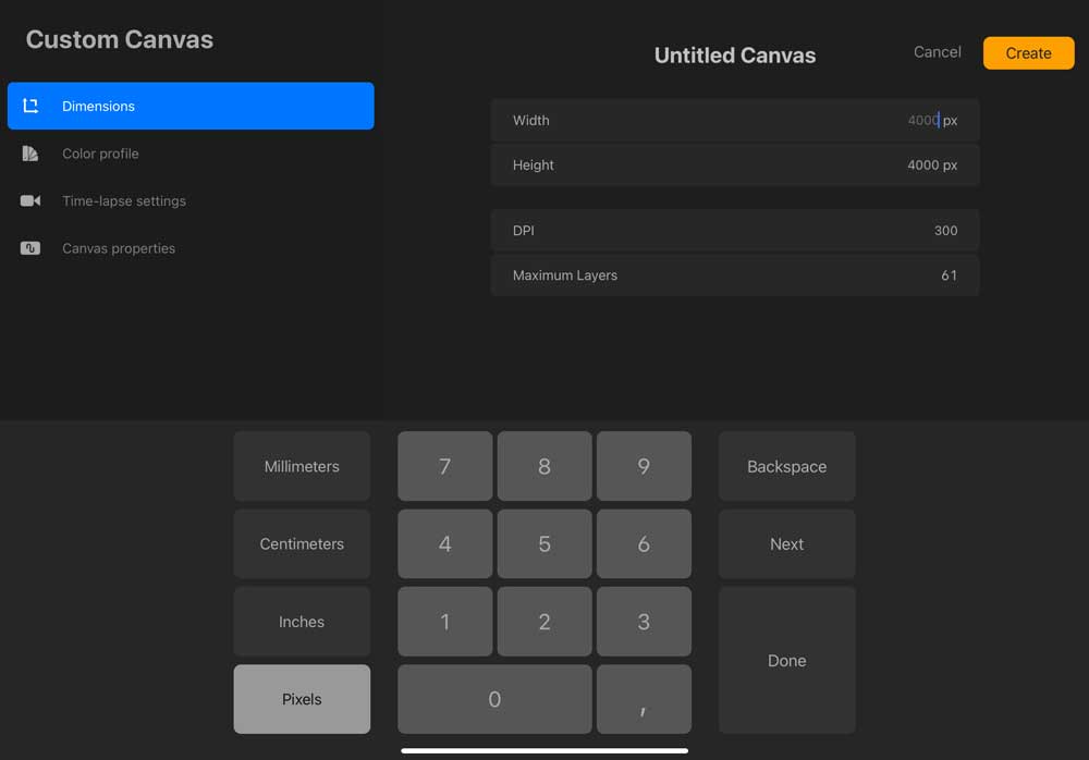
By now, you most probably already saw the ‘+' button in the top right corner when you start Procreate. But that doesn't mean you can set up your canva properly. It's a bit confusing! Just in case you are interested in more tips and tricks about using Procreate have a look here. But for now we start with setting up your canva.
Here's a quick guide in case you need a reference for the canvas size, color profile and resolution set up in future:
Canvas Size
As a rule, your canvas size should always be as large as you'll ever need your artwork to appear. You can always scale artwork down, but scaling it up will result in stretched pixels and blurry edges. If you're creating artwork exclusively to post on social media, then I recommend sticking to their suggested sizes or ratios to cooperate best with their algorithms (see below).

Keep an eye on the layers: The larger the size of the document and the DPI is the less layers you'll have to work on. This also depends on the available storage on your iPad.
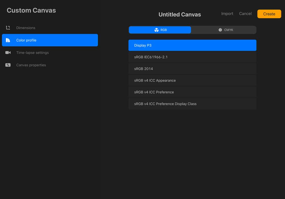
Color Profile
I recommend working in the Display P3 color profile for every piece of artwork you make. Basically, Display P3 gives you the most color capability options. If you make your artwork with Display P3, you can always change it to another color profile later that has fewer capabilities. If you start out with a different color profile that has limited capabilities, you can't expand those by converting it to Display P3. You have to start with all the capabilities or else you never get them. If you're on an older iPad that doesn't support Display P3, use the default sRGB color profile. It's the next best thing.

In "color profile" you can choose between RGB and CMYK.
Resolution
The resolution refers to how many pixels are crammed into a defined amount of space. The more pixels you pack into that space, the clearer + crisper your artwork will appear. 300dpi is the standard print resolution and 72dpi is the standard web resolution. Similar to color profiles, if you start with 300, you can always go down later, but if you start with 72, you can't magically create pixels that never existed in the original art. This is why I recommend always creating your artwork at 300dpi, so you'll always have more options of how to use it (if you make it for social media, but then decide to print it, it's already high enough quality for printing).
With all the different settings now available in Procreate, it can be daunting to know which settings are best for what you’re working on. Here’s some extra info you can refer to if you’re ever unsure why certain settings are better than others 😉
My favorite Resolutions
Here are the best settings for some of the social media platforms:
1500px x 1500px, 300dpi
Why: It’s a little larger than a typical Instagram square (1080px x 1080px) which will give you super crisp edges and extra flexibility if you need to rescale anything. At 300dpi, it has more pixels jammed in for extra crispness, too.
1200px x 630px, 300dpi
Why: This is the current standard size for a facebook post, but we’re upping the resolution (standard web res is 72dpi) to keep it crisp. We aren’t making this one a larger size (like Instagram), since Facebook has cropped images in the past that aren’t the exact size vs. the same ratio.
When in doubt/default settings (i.e. personal artwork or client sketches that you may or may not print or post or use later on)
Screensize (2732px x 2048px), 300dpi
Why: The screensize is equivalent to 9.1” x 6.8” so it’ll be large enough for most standard applications for print or web, but not so large that it’s going to eat up all of the space on your iPad. We’re using a 300dpi res so it’s the print standard if needed and will help if rescaling occurs in the future.
Anything else you might need, consider:
- What’s the largest the artwork will ever be needed for? Make your canvas that size or a little larger, to be safe.
- I recommend always using 300dpi resolution for all of your artwork for optimum crispness.
REMEMBER! You can always scale artwork down, but because Procreate is a pixel-based program, scaling artwork up ALWAYS stretches pixels - if the rescaling is significant, your edges will appear blurry, even if you’re working at 300dpi. My advice: Always make your artwork as big as you’ll need it, so you don’t ever have to scale it up after it’s been created.
Phew! It’s a lot, but I promise you’ll set yourself up well by following a few simple guidelines. I’d hate for you to spend a bunch of time creating your artwork, only to realize it wasn’t created at the right size or resolution it needed to be, causing you to recreate it.
Read more: Can the Recession do something good for us Creatives?
