Creating printables that captivate and engage your audience often starts with choosing the right colors. Color theory is a crucial aspect of design, helping to evoke emotions, convey messages, and ensure visual harmony. In this blog post, we'll delve into the essentials of color theory, how to choose the perfect palette for your printables, and how you can use my curated color palettes to enhance your designs. But let's first talk about color theory in general because it's so important to make your printables sell.
Understanding Color Theory
1. The Color Wheel The color wheel is a visual representation of colors arranged according to their chromatic relationship. It consists of primary colors (red, blue, yellow), secondary colors (green, orange, purple), and tertiary colors (mixes of primary and secondary colors). Understanding the color wheel is fundamental to creating harmonious color combinations. We talk more about this in the Safari Longe Designer Classes but make sure you understand that you always mix the same amount of each color together to reach the desired result. Here is one I worked on using yellow and blue tones.

You do not always need to go with yellow, red and blue. You can grab another pair of colors and still generate a color wheel and therefore colors which go well with each other.

2. Color Harmony
Color harmony refers to the pleasing arrangement of colors. It's about selecting colors that work well together, creating a visually appealing and cohesive design. Here are some basic color harmonies:
- Complementary: Colors opposite each other on the color wheel (e.g., red and green).
- Analogous: Colors next to each other on the color wheel (e.g., blue, blue-green, and green).
- Triadic: Three colors evenly spaced around the color wheel (e.g., red, yellow, and blue).
- Monochromatic: Variations in lightness and saturation of a single color.
See the color wheel above. It started with the three base colors yellow, red and blue but then I mixed a lot of water into them and therefore thy got really watery. Now red, yellow and blue no longer fit to this color wheel but the rest of the colors go together very well as a muted palette. Here are some more examples of muted color palettes:


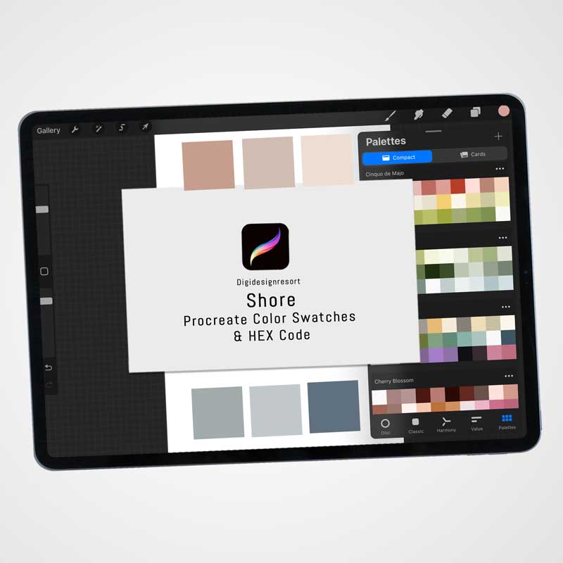
Just click on the images to find the according color palette and no worries - they are NOT just for Procreate but for any graphic program. Hex Codes are included as well!
3. Color Psychology
Colors evoke emotions and can influence perceptions and behavior. For instance, blue often conveys calmness and trust, while red can evoke excitement and urgency. Understanding color psychology can help you choose colors that align with the purpose of your printables.
Choosing the Perfect Palette
It all starts with the question about what you want to do with your color palette. This means that it's essential that you ask yourself first for whom this printable should be for and what kind of colors could suit their needs. Here is a step by step plan:
1. Define Your Purpose Before selecting colors, determine the purpose of your printable. Are you creating educational materials, party decorations, or organizational tools? The purpose will guide your color choices to ensure they are appropriate and effective.
2. Consider Your Audience Think about the preferences and expectations of your target audience. Bright, vibrant colors might appeal to children, while more muted, sophisticated tones could be better for adult audiences.
3. Start with a Base Color Choose a base color that aligns with the primary purpose and message of your printable. This color will be the foundation of your palette.
4. Build Your Palette Using the color harmonies discussed earlier, build a palette around your base color. Ensure the colors you choose complement each other and create a balanced, cohesive look.
5. Test Your Palette Test your color palette on a small section of your design to see how the colors interact. Adjust as necessary to achieve the desired effect.
My Curated Color Palettes
To make the process easier, I've created a collection of color palettes that you can use for your printables. Here are a few examples:
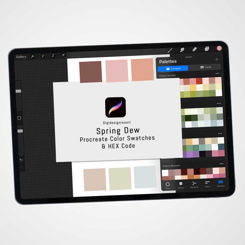
1. Spring Dew
- Base Color: Soft Rose
- Complementary Colors: Cream, Orange Sky Blue, Light Pink
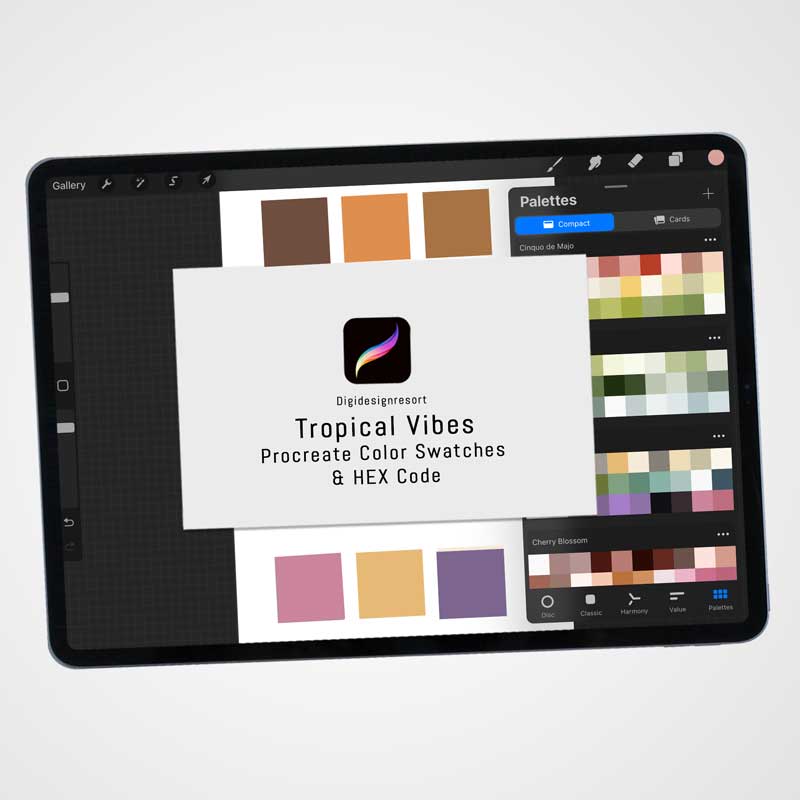
2. Tropical Vibes
- Base Color: Green
- Complementary Colors: Purple, Cream, Blue and Rose
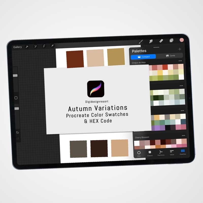
3. Autumn Variations
- Base Color: Brown
- Complementary Colors: Orange, Brown, Cream, Ocher
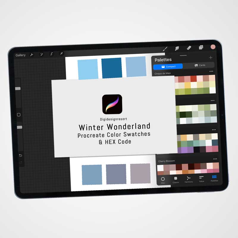
4. Winter Wonderland
- Base Color: Icy Blue
- Complementary Colors: Cream, White, Navy Blue, Shades of Grey
5. Modern Minimalist
- Base Color: Peachy Cream
- Complementary Colors: Blue, Grey, Cream, Light Ocher
Mastering color theory and choosing the perfect palette are essential skills for creating engaging and visually appealing printables. By understanding the basics of the color wheel, color harmony, and color psychology, you can create designs that not only look great but also effectively communicate your intended message. Feel free to explore and use my curated color palettes to enhance your next printable project.
Free Color Palette for you!
Try my color palettes completely free. You can download a package from the store. You are automatically added to the newsletter but you can uncheck at checkout so you don't need to subscribe but then you are also not informed about new freebies 🙂
Enjoy the color palette!
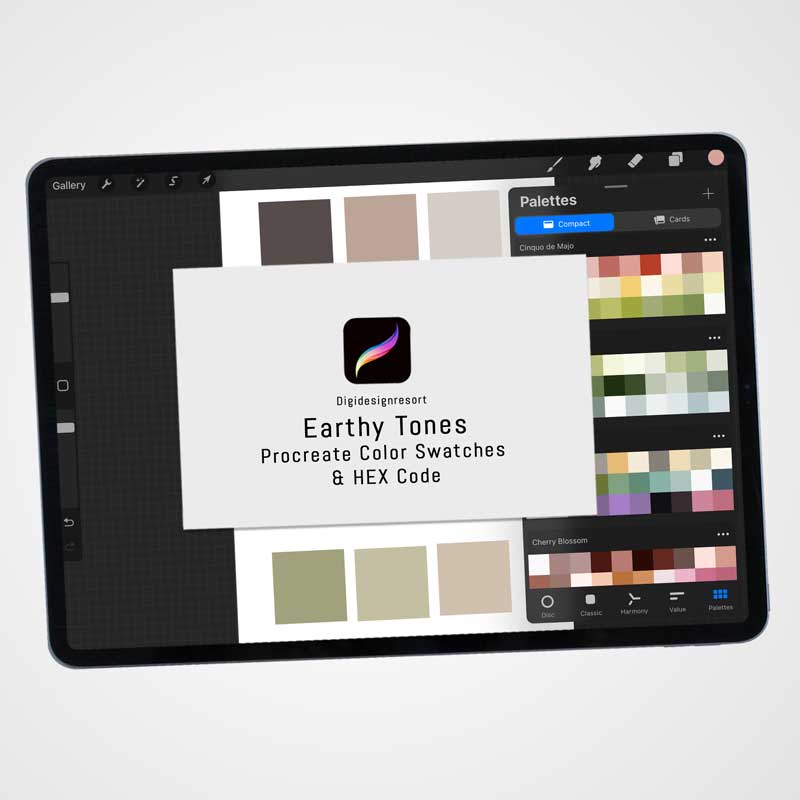
Here comes a free Procreate Color Palette - but it's not just for Procreate, you can also use it in any other graphic program because I've added the HEX Code so you are all set.
Want them all? Join the Safari Lounge and you can find all color palettes there! It's free for 7 days 🙂

Safari Lounge Designer Classes
Learn everything you need to know to build a sustainable Business for Educational Printables. Let's create and plan your business together, and then: Market your products. It's all there,
personal coaching included! In case you just wanna have fun and create some printables for your little ones - that's inside as well!